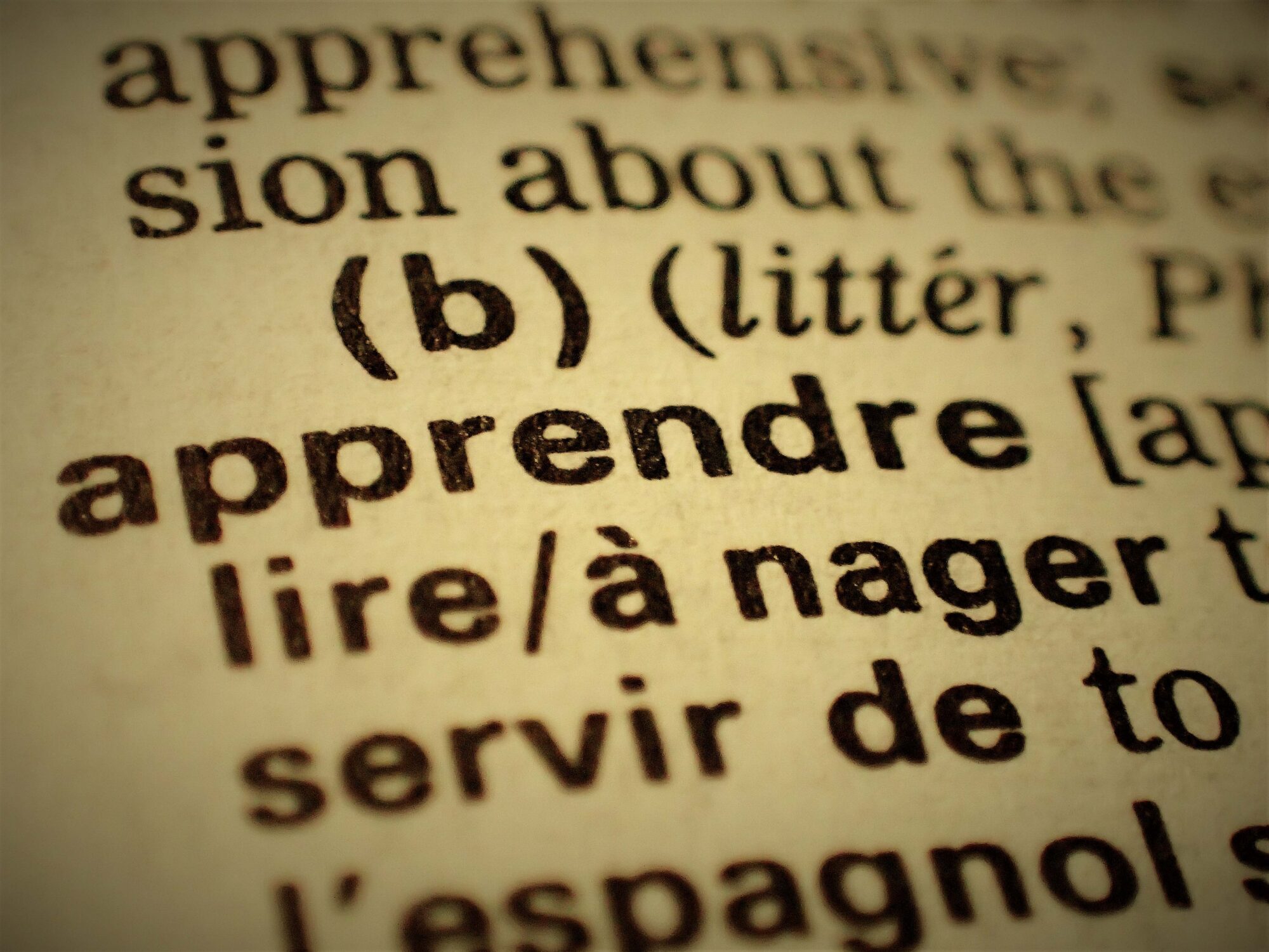
Sparked by the invention of the printing press and accelerated by computers and keyboards, we are constantly surrounded by a medley of different fonts, whether it be in warning signs, books, advertisements, maps, closed captions and many others. We are exposed to all sorts of texts, fewer of which are being handwritten. In this article, I want to explore the subconscious impacts of different fonts on our brains.
Most fonts can be sorted into two main categories, serif and sans-serif fonts. Serif fonts are fonts that contain small strokes at the end of larger ones such as the little flick at the bottom of a lower-case t. This font family may originate from when the Latin alphabet was carved into stone; the letter outlines were first painted onto the stone and stonemasons would then carve the letters along the brushstrokes, which flared at the end of the strokes, creating serifs. However, this story is not widely accepted and another explanation for the existence of serifs is that they were created to neaten the ends of strokes. Some well-known serif fonts include Times New Roman, Garamond and Georgia. Due to its association with tradition, authority and reliability, you’ll often see them being used in branding for companies that need to appear reliable and trustworthy, for example, schools, law firms and news agencies.
The other family of fonts I want to talk about are sans-serif fonts, meaning they don’t have any smaller strokes at the ends of lines. The increased use of sans-serif fonts can be explained by computers: in the early days of people using computers and digital screens, serif fonts would have been harder to decipher on screens with low resolutions due to the serifs being hard to see. However, as digital screen resolution advances, this is becoming less of a problem. Sans-serif fonts are often associated with simplicity, accessibility and practicality, due to being easier to read, and being friendly towards people with low vision and dyslexia. Sans-serif fonts also have more variation within the family than serif fonts, filling a wide range of roles including on warning signs, and in branding for small businesses trying to set themselves apart from bigger companies.
One way in which people process text is using Bouma shape recognition, or a ‘Bouma’ for short. This is the shape of a cluster of letters, for example a word or phrase. The model suggests that instead of reading each letter individually, people recognise words based on the shape of the text. The word is named after psychologist, Herman Bouma. The ability to recognise the shape of words is heavily influenced by their font, for example, words in capital letters are harder to recognise due to there being no change in the height of the letters. Another example is with script fonts; with the serifs, inconsistent gaps between letters’ decorative features make fonts like these harder to read, especially for people with dyslexia.
Another newer and more widespread model for how humans process words is parallel letter recognition. The model proposes that instead of recognizing the overall shape of words like in a Bouma, our brain recognises all the letters in a word simultaneously and compares them to words we already know, thus allowing us to re-assemble the recognisable word.
Although parallel letter recognition is considered an accurate model for how people process words, there is some truth in Bouma shape recognition and inconsistent formatting can still throw off your reading.
In summary, people don’t read text letter by letter but instead recognise the letters of a word in parallel, a skill which develops naturally in order that we can read more quickly.
You may have already realised from reading this article, that the fonts chosen to represent different entities are picked intentionally for a certain characteristic that they may have. One very common example of choosing fonts for a specific characteristic is on road signage. You may notice if you drive often that most directional signage that is meant to tell you where you are going is in lowercase sans-serif; this is because lowercase letters are significantly easier and quicker to read than uppercase letters. This is important because as you drive, you can’t stop to read signs and need to be able to recognise place names in under a few seconds before you pass them by, making the choice between upper and lowercase especially important. On the other hand, bold uppercase fonts are used in warning signs due to them being eye-catching, memorable and legible at a distance, making them ideal for use in signs that are meant to be authoritative and to indicate safety hazards.
Aside from signage, typography has a significant impact on advertising and branding decisions. Fonts are carefully chosen to improve readability, noticeability and memorability, allowing adverts to leave a longer lasting impression on consumers, with the intention of persuading consumers to buy a company’s products or services.
In conclusion, typography, which may seem like a not-very-interesting art of making written language legible, has a huge psychological impact on your perception of words. All this research was done on fonts that use the Latin alphabet but further interesting results may be uncovered by researching how fonts are designed to achieve certain effects on the reader in other writing systems.